
Making complex academic options clear and navigable, so students can confidently choose the right graduate program.
The University of Maryland Graduate School is a leading hub for health and biomedical education, offering dozens of advanced programs for future researchers and practitioners.
The information architecture was fragmented, navigation paths were unclear, and the existing program finder took multiple steps and often surfaced incomplete or irrelevant results.
How might we help students feel confident they have found the right graduate program for them?
Every move below is an answer to that question.
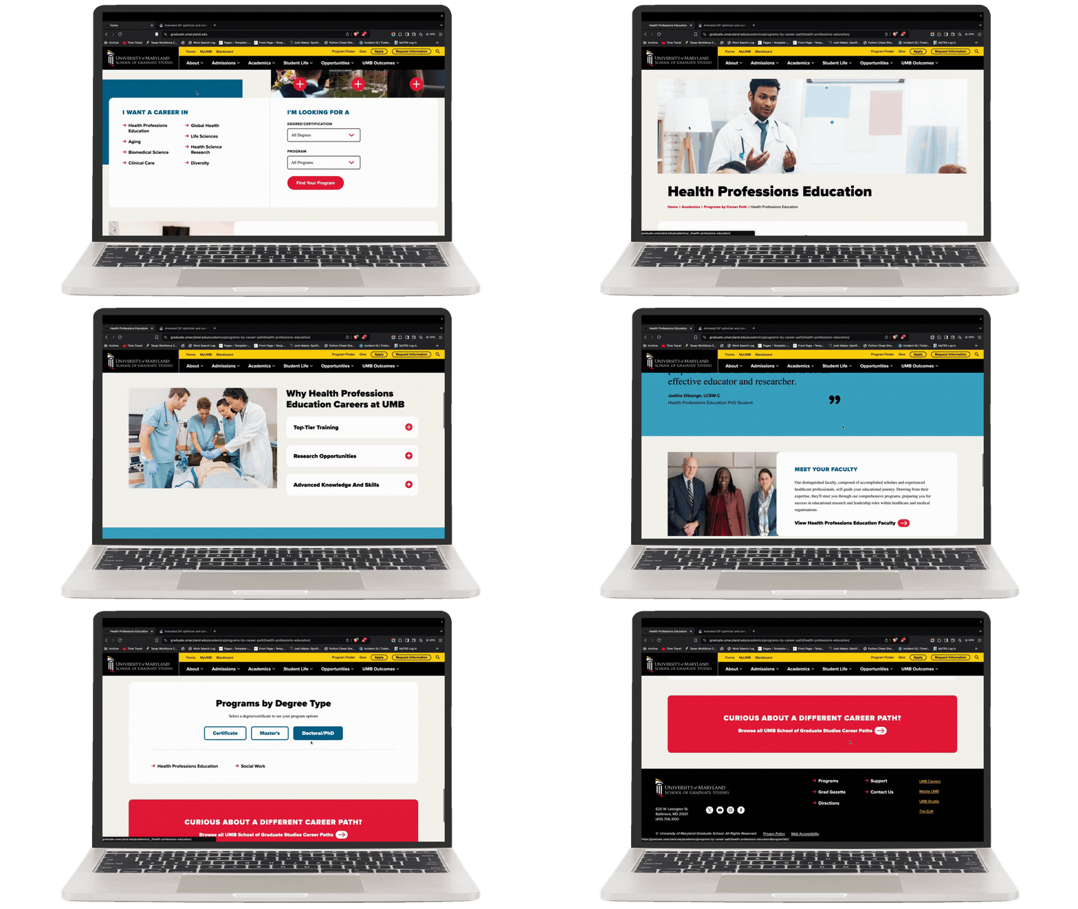
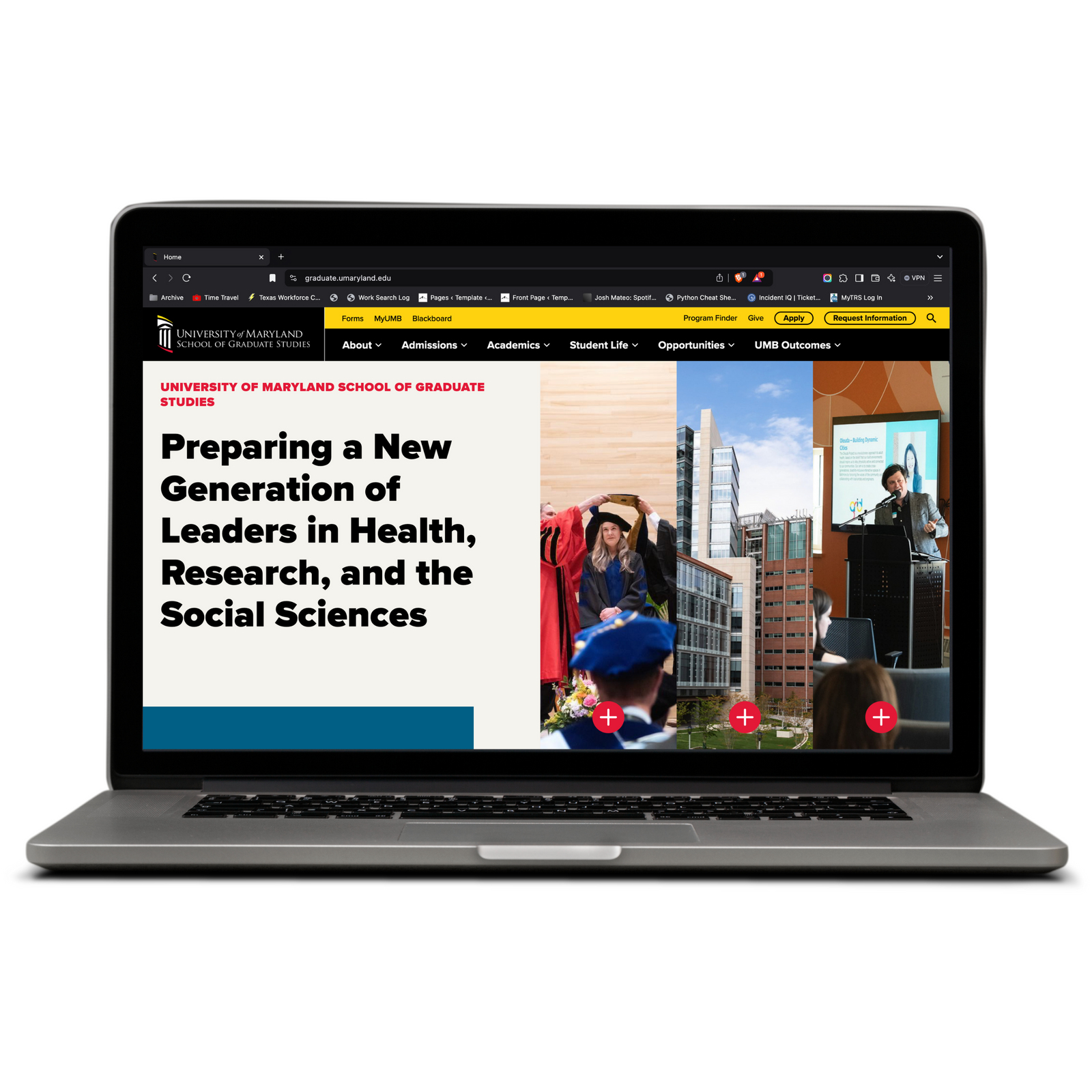
The old nav mixed student utilities in with the story of the school, and discovery was a catalog to browse. The restructure separated the two and reframed programs around where a student wants to end up.
In interviews, students described the difficulty of finding what they needed through the menu. I reorganized the information architecture to be process, opportunity, and outcome driven, giving fast access to utilities and programs.
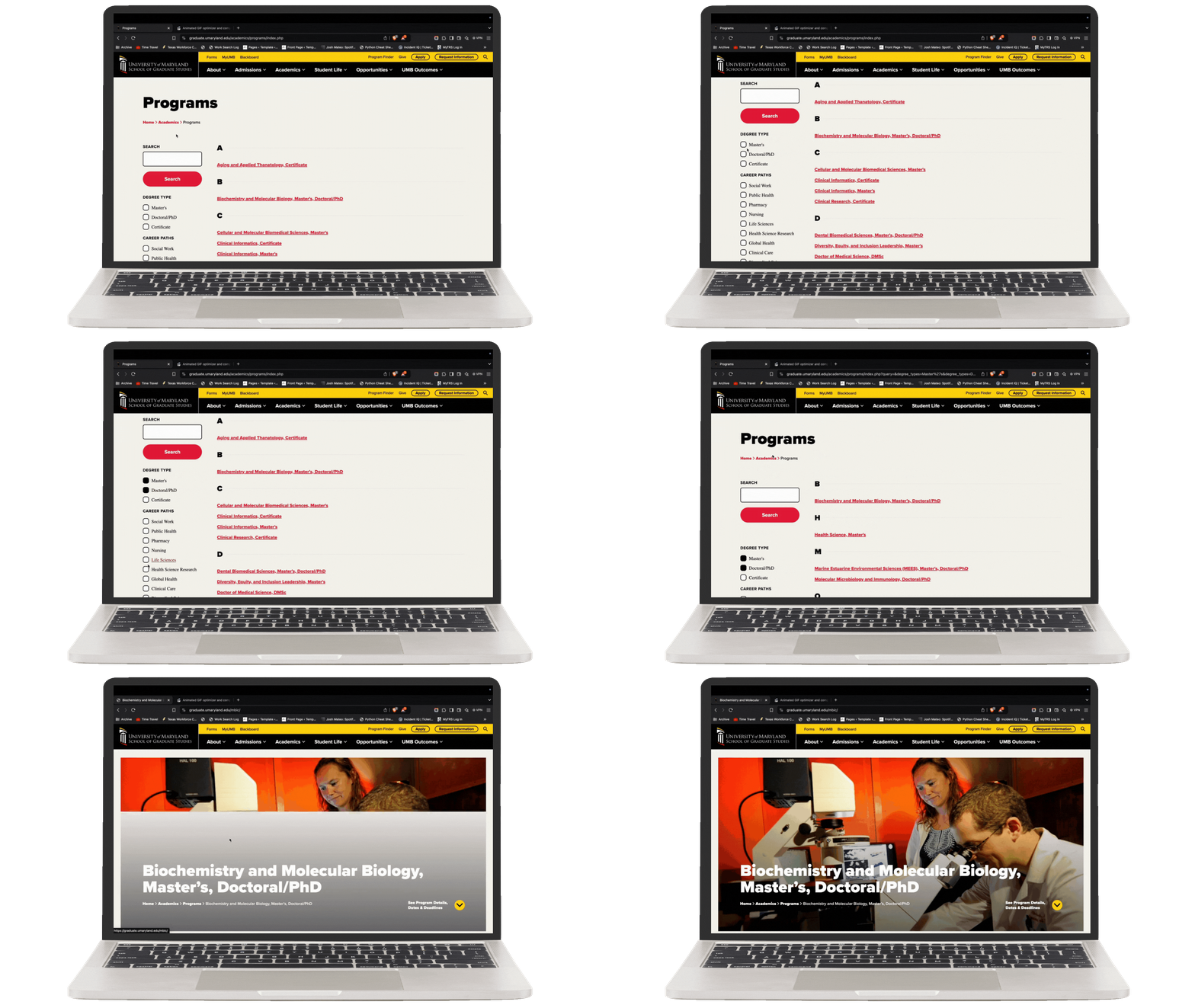
Research showed the old finder demanded too many steps and still hid results. I redesigned it to hold every option on one page: a simple search, a multi-faceted filter, and clear results.
Staff flagged how hard it was for students to sort through the many options inside the Physician Assistant program. I built a short survey that routes each student to the PA pathway that best fits their interests.
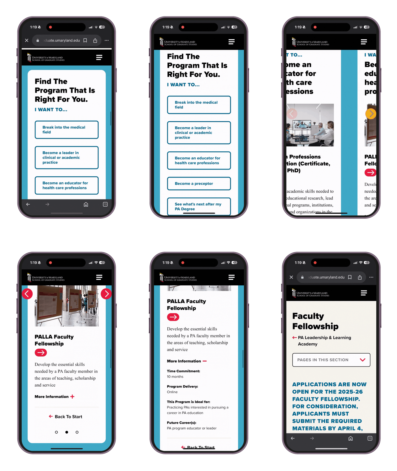
The redesign turned a fragmented graduate ecosystem into an outcome-driven one. Utilities moved out of the way of the story, every program now sits on a single filterable page, and the school's most complex program routes students by interest instead of asking them to decode a catalog.
I built the prototype and ran usability testing for this project. Both are internal and can’t be accessed at this time.